The Basics of Candlestick Charts
Candlestick charts are used to display market data in a simple and compelling way to traders. This is done by representing various sizes and directions of price moves with different colors. Traders use candlesticks to make decisions about the markets, based on patterns that emerge.
Time Interval
Each candle represents a time interval, and the market price movement during that segment. The most common time intervals are 1 minute, 5 minutes, 30 minutes, and 60 minutes. This time interval is sometimes called the chart’s resolution. Some traders like looking at charts with 5-10 second resolution, but for most day traders, a 1 minute resolution chart is perfectly fine.
Colors – Up and Down
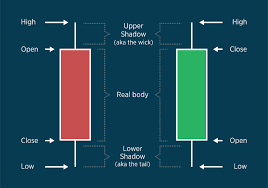
Each candlestick displays the market’s high, low, open, and close price of the period. Each candlestick has three parts- the main body, the upper shadow, and the lower shadow. The real body displays the range in price between the period’s opening and closing price. This range is demonstrated by the height of the candlestick. Candlesticks are generally color coded, to make them easier and faster to interpret. If the closing price is higher than the opening price, it is an upward candlestick, and the real body gets shaded green. If the closing price is lower than the opening price, it is a downward candlestick, and the real body gets shaded red. However, many platforms allow traders to change the colors of up and down candlesticks, depending on personal preference.

Shadows
The lines marked above and below the real body are known as the shadows or wicks. The difference between the high of the period and the opening/closing price is called the upper shadow. The difference between the low of the period and the opening/closing price is called the lower shadow. The upper shadow is always above the real body, and the lower shadow is always below the real body. The longer a shadow, the more distance between the period’s high or low price and the open or close price.
Traders use the data displayed in candlesticks to make decisions. A candlestick chart might like random, but experienced traders can easily see patterns that arrise. By looking at these patterns, they can create and develop trading strategies. For example, long shadows relative to the length of the real body can indicate high volatility.
Candlestick charts are the most common way for traders to get data on the markets, so learning to read and interpret them is crucial. This article is a basic outline of what a candlestick represents. If you’re interested in other resources for entering the trading market, you can read more on the BetterTrader.co blog and explore other posts related to the markets. You can also open a free demo account to practice trading, using proven and effective tools to test your ideas.


